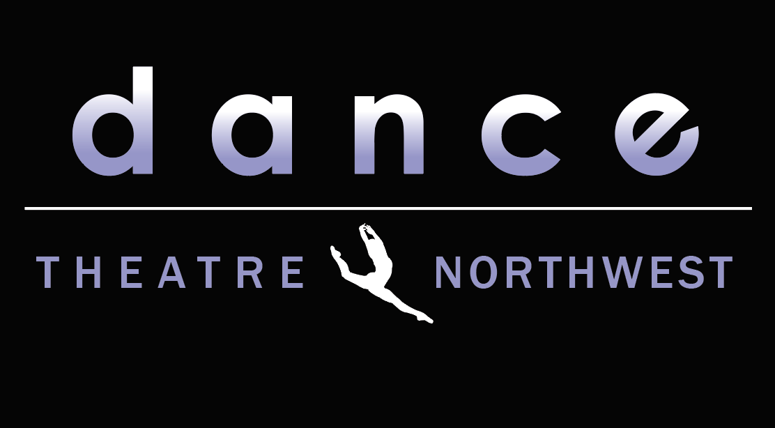
Dance Theatre Northwest
Versatile logo creation for a dance studio in the St. Louis, MO area. The process began with the studio’s current logo. Using their focal image and studio colors, many logo renditions were created.
After narrowing the selection down to a few logos in various categories (circular, floral, linear). After reviewing the logo offering, two of the more versatile logos were selected for test garment printing using digital printing & vinyl heat-transfer. Two logos were chosen to be printed on tops, bras, leggings, and shorts for the customer. The studio colors were highlighted in the designs, staying true to the studio while giving their current logo a modern edge. Dancers at DTN can now represent their studio in style both in and out of class.